This is a UX case study on solving echo audio issues when people use video conferencing applications.
1. Can you hear me?
This is one of the most frequently asked questions when we join video meetings. We want to make sure our voices are clear and identifiable.

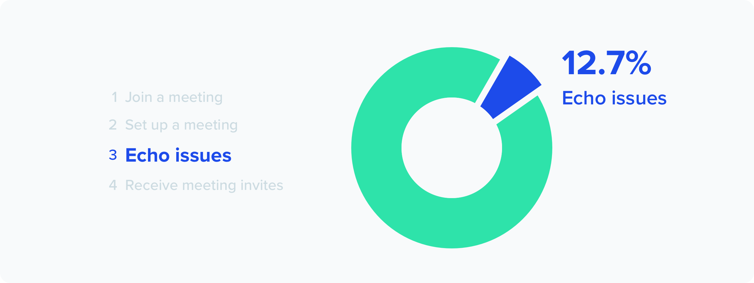
At times, when we join video meetings and we cause echos unintentionally. The side effect is we bring frictions to the meeting and we look bad in front of others.
Two years ago, I contributed to the design of BlueJeans Meetings, a desktop app that connects people to video meetings. At its core, the app is to bridge the gap between hardware devices and provide a cloud-based meeting experience that’s better than being there.

As a designer, my mission was to create the best video experience for an extensive range of users (age between 18–70). I want to design a useful tool for people who attend and host video meetings to acquire knowledge, spread ideas, and facilitate collaboration. And the first and foremost challenge for me is, make audio work in all cases. That means I need to eliminate the echo issues as much as I can from video meetings.
2. Slice and dice — what is an echo?
To truly understand what an echo issue is, I collaborated with the audio engineers on our team. I learned that an echo issue usually involves 2 major types:
1. Audio echo
An audio echo occurs when multiple devices have audio connections and they are both set to on. This can happen when a participant has both the computer and phone audio active.
Let’s say, David, called into a video meeting on his phone during his work commute. When he arrived at the office, he walked into the conference room when the room was also connected to the same meeting. Hence, the echo happened.
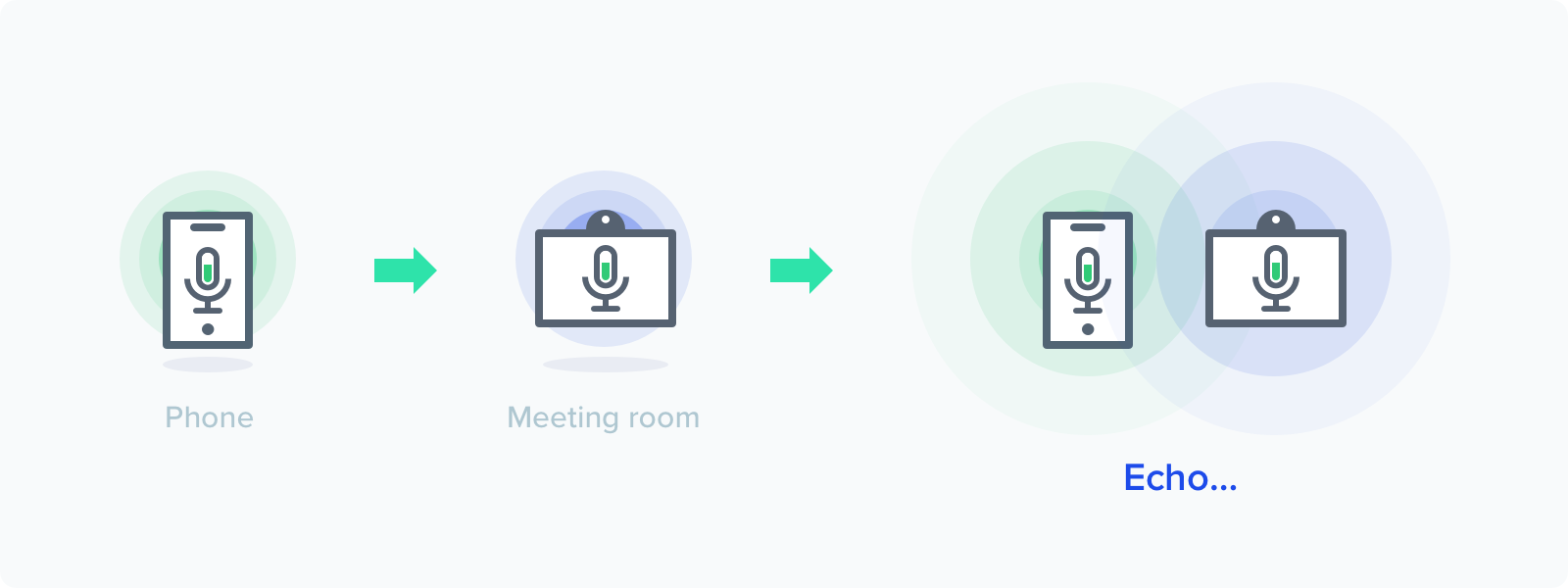
Echos are not just limited to computers and phones. For example, Giselle was sitting in a meeting. She was ready to share a presentation on their laptop. Giselle joined the meeting on her laptop, but she forgot to mute her laptop and it echoed.

2. Audio feedback, also known as “howling”
Audio feedback, or howling, can happen when a computer or phone speaker are placed too close to each other. A common scenario can be:
Mark had a demo recording on his laptop. He also had a few screenshots on his phone. During his demo, he joined the meeting on his laptop first to present the recording, and then he switched to present the screenshots on his phone. When he put his phone next to his laptop, the howling kicked in.

3. Map out the audio experience
Echo audio issues usually occur when we join meetings. Since we may use different devices from time to time, it’s unreliable to account on our devices to figure out our audio preference. If the hardware is incompetent to do the job, is software more intelligent at it?
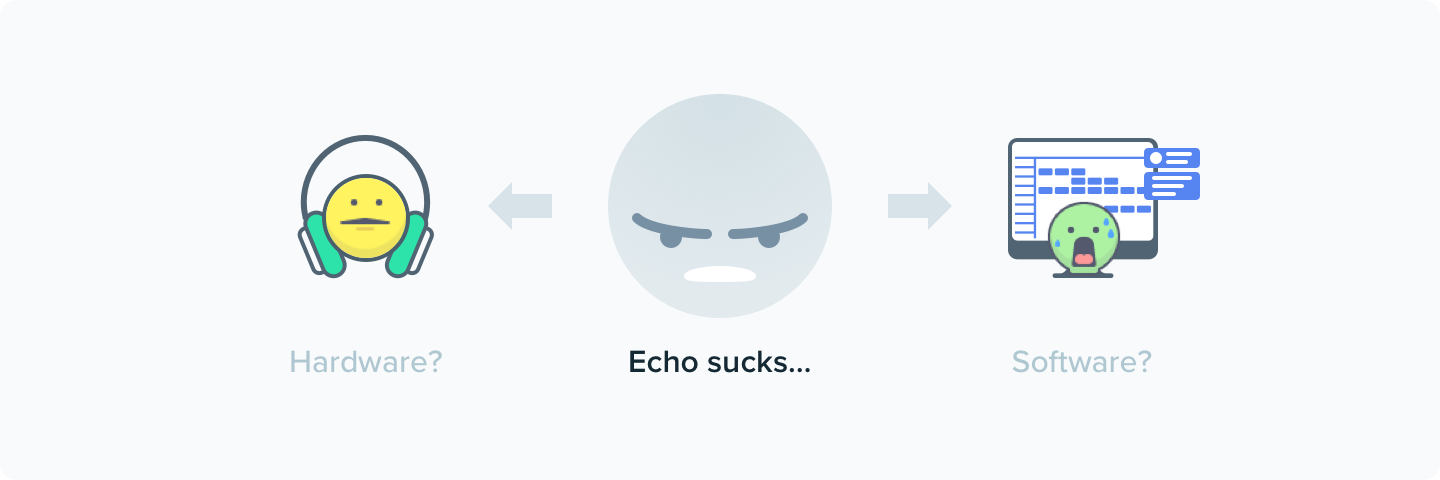
The software can make a better guess. It has all your data from your previous joined meetings and used devices. It can pick up a most likely preferred audio resource for you, but it can’t predict 100% accurately. If you are a remote worker and you join meetings from various places, home, coffee shops, and coworking spaces, your audio connection varies all the time. In this case, the software can fail. Only you know what your preference is.

When we attempt to autopilot the audio connection experience for our users, our users end up getting confused and frustrated.
“ It’s echoing. What do I do?”
This dilemma led me to map out the entire audio experience when people join video meetings from all different places. Here’s how’s like:

A key finding here is that people join video meetings through web links. They see links in their emails, calendar invites or Slack messages and they act on them. No matter what device people use, it directs to the same meeting link.
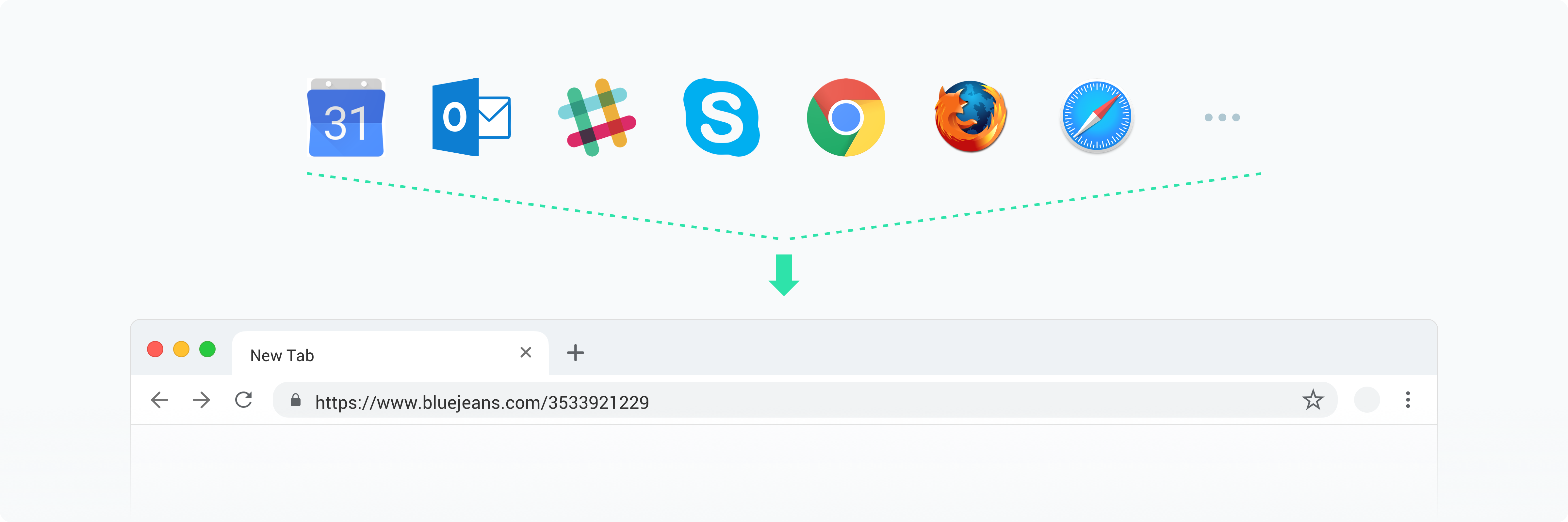
If we can ask our user what audio resource they want to use and guide them to pick up the correct one, would it help solve the audio issue?
4. Design a dialog that solves 90% of echos
The discovery channeled me in designing an audio selection screen. My designs goals are:
1. Describe the state precisely.
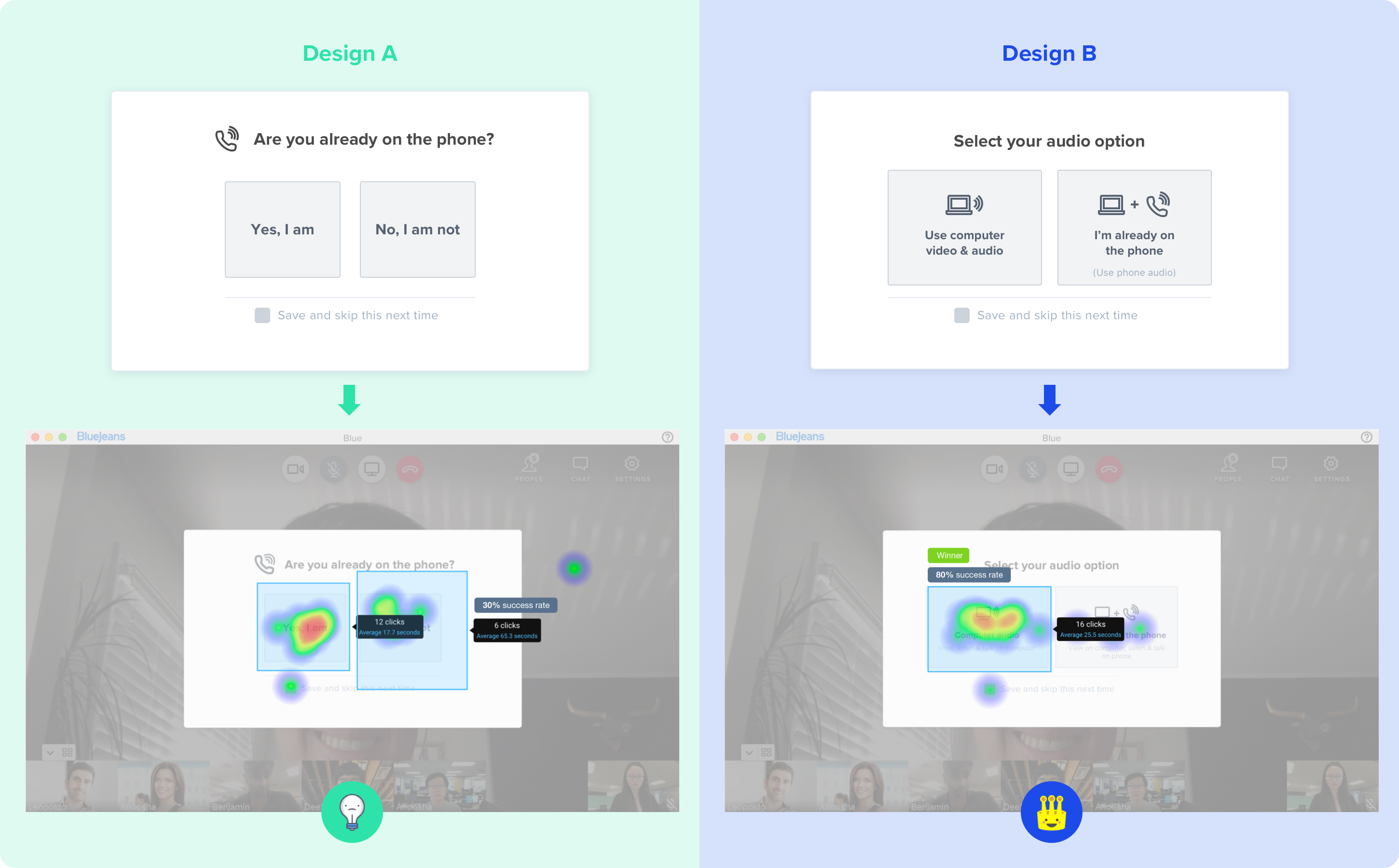
In the first experiment, I learned that asking our users a straightforward question is better than being ambiguous. Don’t worry about being technical.
2. Guide and emphasize users’ choices.
In this experiment, I explored two button layouts for displaying audio options. It turned out that bigger buttons are more effective, even they’re not conventional. The contextual information on the buttons also helped in providing context.

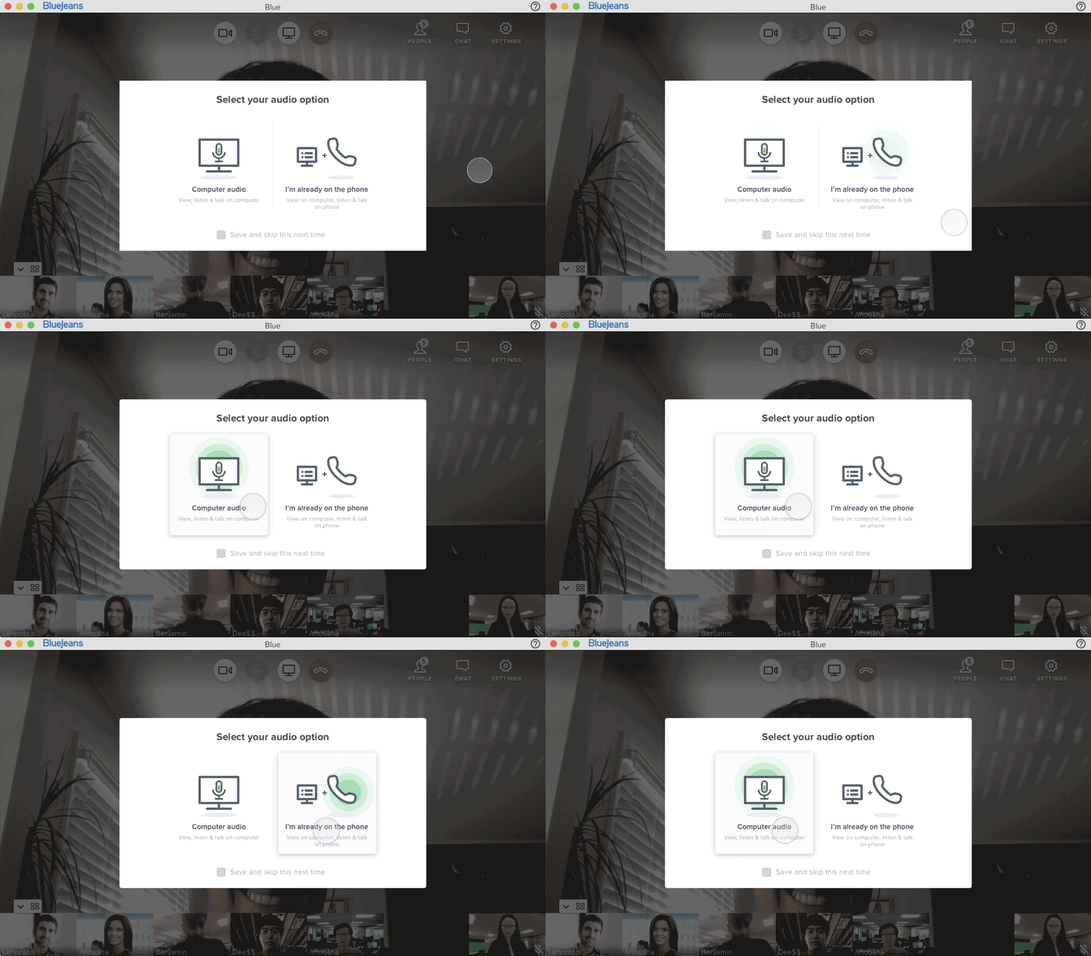
In the final design, I included motion effects to emphasize users’ choice and visualize a sense of connected audio.
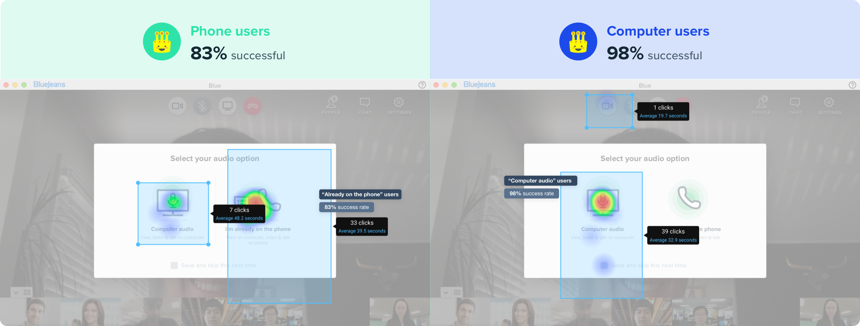
When testing on the final design, the result revealed that not only our users who join meetings on their laptops can get this right, but also our phone users are capable of making the right choice.
5. Summary
Sometimes design solutions are not about auto-piloting everything. What we can do is to understand that people make mistakes and we can help them make diligent decisions to prevent mistakes from happening. Effective communication starts with clear guidance and rewarded actions.


