Custom Ink Design System

This design language defines and evolves the brand of a business founded in 1999, making it contemporary and scalable across five commercial and three internal applications to enhance customer experience.
Overview
Upon joining Custom Ink, I had the opportunity to evolve a simple styling sheet in Sketch into a functional front-end framework. This design system promotes consistency across both commercial and internal user experiences. Initially, I was unsure of who my partners would be, when the project would be considered complete, or how I could influence a design team of 20, 5 product engineering teams, and a product organization still learning about the design system. Despite these uncertainties, I was eager to take on this challenge because I believed that effective design systems can connect and scale a business. I was also keen on learning about becoming a design manager, so I could effectively lead both the design system team and product design teams. Through the journey of adoption—which included defining the design language, establishing standards, and refining practices—I built trust with cross-functional teams. I also led product designers to successfully apply the design system in their work and laid the groundwork for best processes and practices to thrive. Fast forward to today, the design system repository now empowers a tech organization of 500 members. This includes members from design, engineering, product, and D&A teams, all working to create customer value at scale. The system encourages usage and contribution from individuals across the U.S. and Prague, with over 50,000 single-component insertions per week. Prior to this, the number was zero for both design and engineering teams as products were based on one-off styles and CSS changes. The system is remote-first and React-based, making it widely accessible and reducing the onboarding schedule for product engineering teams by two-thirds. It is synchronized with a component library in Figma and connected to a public documentation site through Storybook. Most importantly, it has sparked a community-based support network on Slack for internal creators. With the support of my design leaders who sponsored this initiative, and the design system designer I guided, I aim to share insights for future design system teams to join us. We call this system 'Pigment.' It represents an ink drop on a custom shirt, a fitting symbol for what Custom Ink has been known for over the past two decades: bringing people's creativity to life through custom shirt designs.
Research
In beginning our design system project, coinciding with acquiring a Figma organizational license, we aimed to use Figma for managing designs across products and the design system. My design system colleague and I conducted an audit to identify key components and patterns, resulting in a consolidated file for a unified design overview. We evaluated existing style guides across three main areas: 1) Design Lab: Customers design and apply creations to merchandise. 2) Account Management: Customers access and add saved designs to their cart. Online Store Setup: Customers create online showcases for their designs. 3) Our findings highlighted the frequent use of foundational elements like Typography, Color, and components such as Buttons, Text Fields, and Alerts, indicating a clear need for a design system to unify the design language. The audit revealed a significant challenge: the scarcity of ready-to-use components necessitated building the design system from scratch.
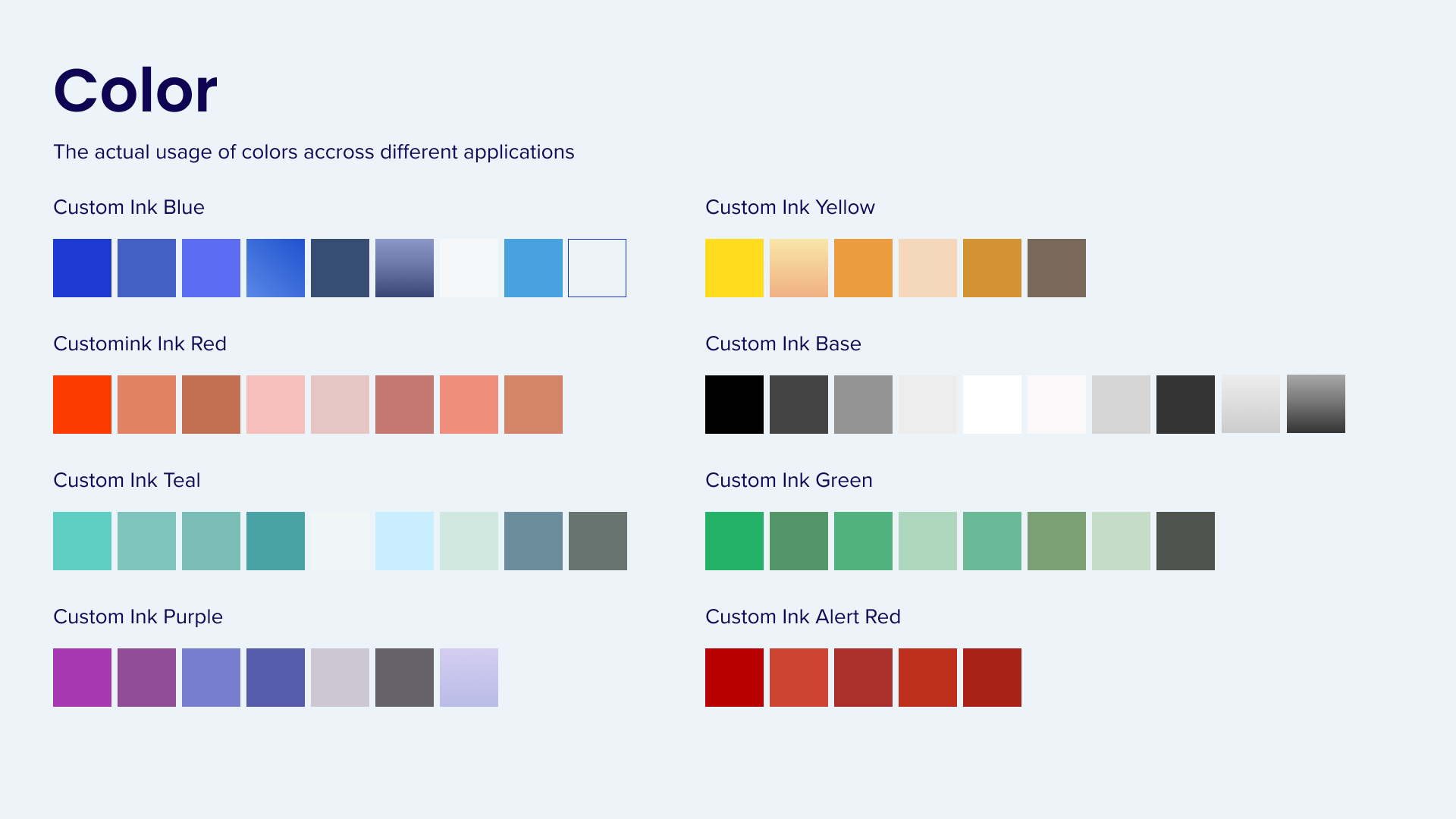
Define foundations
During the auditing process, we began to establish the foundations of the design language. We structured Typography and Color styles with a focus on semantic and interactive contexts, which are essential for designing user workflows. We expanded the color system from just brand colors (5 in total) to a tonal palette for each key color, establishing color relationships (including primary, secondary, tertiary). We also applied the concept of roles to Typography. Text styles were defined according to primary use cases (desktop, mobile, and display), and we introduced groupings based on interactivity (Heading, Body, and Component).
Form partnership
Through conversations with multiple product engineering teams, I discovered that they had limited knowledge of Figma. This lack of understanding, due to the tool being recently introduced in the organization, prevented them from properly inspecting design specifications in Figma files. It also made it difficult for them to distinguish between non-componentized elements and global components adhering to design system standards. To address this, I led a remote workshop for the tech organization that was attended by about 200 engineers. I guided the group through the process of inspecting components in project files to retrieve variant and property information. Following a group exercise, most engineers could inspect a sample design that used linked styles and global components. They also joined the design system's Slack support channels to access our curated list of learning resources.
Form sponsorship
The tech organization where I am positioned uses the design system to connect dynamically with other functions like Customer Funnel, Marketing, and Operations. Some of my initial efforts included mapping influential relationships and inviting groups with concerns about the design system to join monthly team meetings. This way, we could collectively address their concerns. I learned that gaining support from every team can take time, and optimizing the design system for early adopters is crucial due to the word-of-mouth effect. I also realized the need to better align the design system work with the product teams' workstreams, building a strong alliance to improve system efficiency and reduce lead time on product teams' sprints. Throughout the year, my design leader and I created and maintained a project board that connects with other engineering teams' execution boards. We rolled all design system work up to senior leadership reports to communicate priorities, progress, and impact.


Opportunity
A challenge I faced was helping designers initially learn how to use Figma, before they could realize the value in using published components and customizing component properties. This issue arose during a group interview session when I asked the team to share their confidence level in using the global components library. Here are some key themes that I later addressed:
Unable to locate the latest published components
Many team members weren't aware that the global component library in Figma is enabled by default, allowing them to access the latest components through the asset panel. Instead, they kept the component library file open and pinned, copying and pasting components from the library into their design files.
Struggling to stay updated with library changes, leading to misuse or disuse of components
Half of the team spent less than 50% of their weekly time in Figma, due to other tasks like conducting research, refining information architecture in Miro, and attending stakeholder meetings. They often missed the latest updates from the design system team, lacking time to familiarize themselves with the newly published components. This resulted in a disconnect when resuming design work, as they weren't using the appropriate components and patterns.
Having difficulty enhancing the quality of design hand-offs and introducing design system reviews too late in the process
Numerous team members, including senior designers, expressed uncertainty about "how designs are transformed into code". Consequently, they delivered designs that minimally use components, or they asked for input from the design system team just a day before the scheduled hand-off. This causes prolonged discussions between the design system design, design system engineering, product design, and product engineering teams, which in turn delay development.
Design solution


Feedback
To help product designers use components more effectively and speed up their workflows, I arranged a two-day Figma training event. The event focused on three key areas of the design system:
1. Creating a new project with consistent naming, a templated file structure, and a Figma library for use across all projects and domains;
2. Using global and customized local components to diverge and converge, including a detailed look at the asset and component properties panel;
3. A demonstration by frontend engineering on how to inspect a post-handoff design file, including reference checks to component documentation, the Github repo, and annotation.
Each session included a hands-on group exercise, inspired by Jana Choi, the Design Tools Lead at Capital One. This approach helped designers learn by doing and elevated their system-thinking through integrated use of our design system. As Choi succinctly stated, "By using design systems, designers aspire to become better designers."


Improvements
To increase visibility and gain buy-in for our design system, I identified key results to help forecast milestones and success metrics. It was crucial to bring the engineering leadership onboard, especially as our tech organization was focusing on improving efficiency and transparency using project management tools like monday.com, and Web Ops models like DORA metrics.
I realized that the existing adoption analytics in Figma were insufficient. They indicated usage, but lacked usability measurements and didn't account for the engineering teams' perspectives. After researching additional metrics in the business-facing design system space, I found three options:
1. Measure the System Usability Score (SUS) through quarterly surveys;
2. Measure the Transactional Net Promoter Score (tNPS) after designers hand off projects;
3. Measure the Standardized User Experience Percentile Rank Questionnaire (SUPR-Q) through surveys for usability insights, and more, including Trust & Credibility, Appearance, and Loyalty.
After discussing these options with my leaders, it became clear that the SUS was the best fit. It frames the design system as a "product," helping to negotiate engineering resources and gain buy-in from product leadership. The ability to convert SUS to NPS (a SUS score of 70 equals an NPS score of 7, indicating a "promoter") offered flexibility for potential business pivots. We decided to use this approach.
Considering both the design and engineering teams, our quarterly System Usability Scale (SUS) score averaged 74.5 out of 100, which is above the average usability percentile of 68 out of 100. My efforts to improve system usability led to significant engagement from the engineering teams. They contributed numerous improvement ideas, including better orientation for teams to consume development documentation, evangelizing Dev Mode, and introducing a more collaborative model between the design system and product engineering teams.


Testing
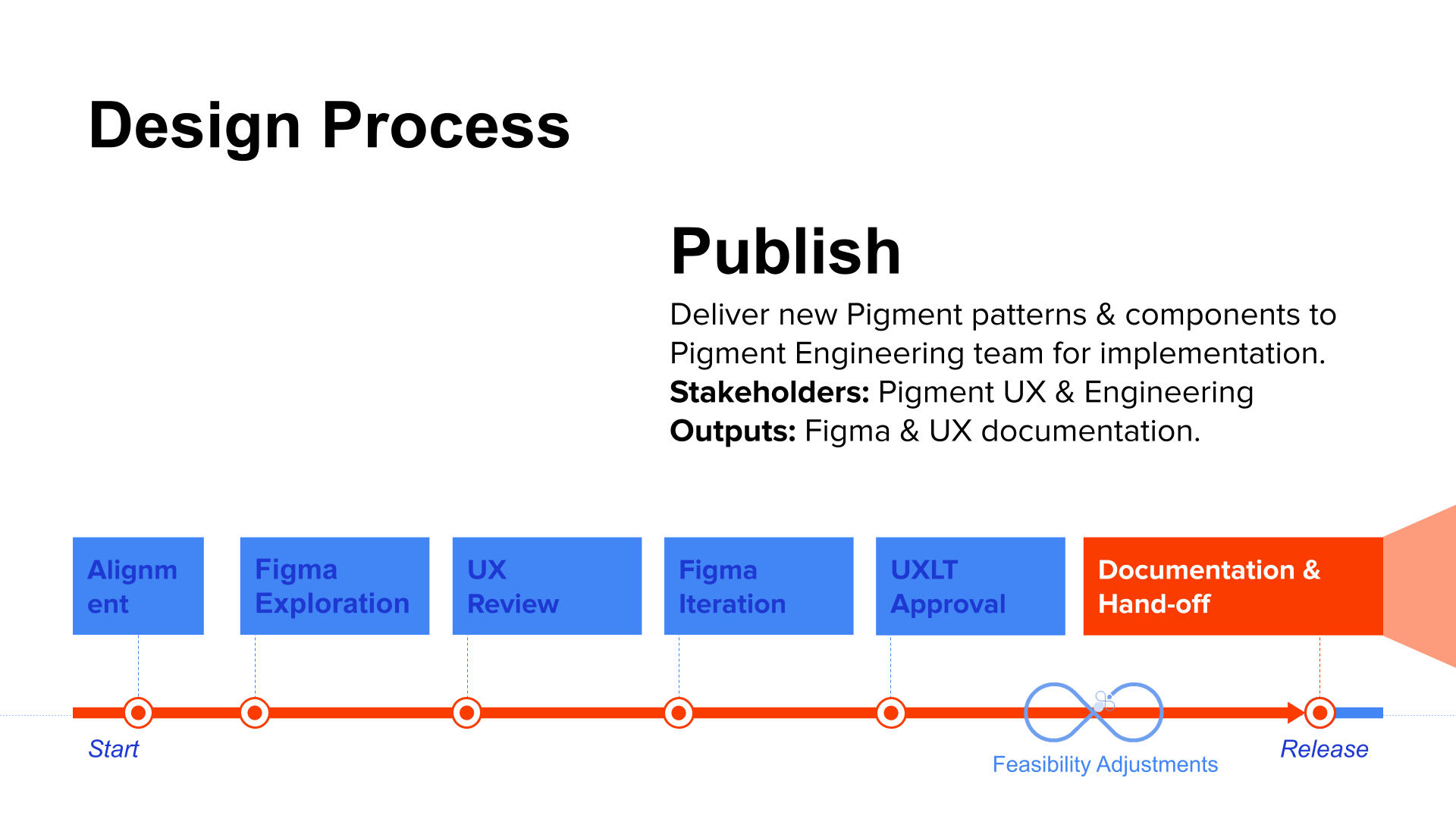
To ensure the durability of newly built components, I collaborated with the engineering manager to include design system designers in the pull request (PR) review process. In addition to the main engineering owner who developed the component, we involved one designer and one engineer in the peer review process. They provided constructive feedback on visual and interactive inspections, documentation, and stress tests. Once the components were reviewed, approved, and merged into the new build, we used Chromatic to manage and share the latest version. This allowed product engineering teams to update and utilize the design system in new features. Finally, the component documentation, including APIs, is published on the main documentation site (https://pigment.customink.com/) for use and reference.

Outcome
The design system, Pigment, at Custom Ink was a truly design-led initiative. It transformed how designs could apply the power of a system to create an empowering experience. Every step demonstrated a new level of design quality. The team has proudly accomplished several achievements:
55%+ design system adoption rate
A design team of 20 uses the design system to create new experiences in both commercial and operational domains. They oversee more than 10 production applications across web and mobile platforms.
The System Usability Score is 74.5 out of 100
This score is about 10% above the standard usability percentile for both the product design and product engineering teams.
Feedback exceeding expectations was obtained through a post-event survey after the Figma and design system training event
“It was very helpful! Before the event began I was hesitant to dedicate the time. It was well worth the time. I am so impressed and thankful for the team for putting this together! It was better then some events I’ve attended that I had to pay money for!”
Expand the component library in Figma and the codebase
• 5 product engineering teams actively use and contribute to the design system (Artemis, Frontier, Katamari, Nautilus, Wiz Kids).
• 7 production applications are built through the design system (Catalog, Design Lab, Cart, Checkout, Account, Storefront, Inventory Management).
• There are 28 development-ready components and 21 production-ready components.
• We have 1 global component library, consolidated from 4 sub-libraries, and 1 public dev documentation with reusable APIs.
• 212 icons are in sync with the codebase.


Testimonials
Plus:
“I've recently used the card, button and typography. They are really helpful to use in my designs - both as "finished" components (for projects like Community Platform) and the basis for more creative explorations (like homepage work). It really helps establish a baseline and consistency across the entire platform.” - Product designer
“Dialog w/ alert, alert, chip, button. Yes, the dialog w/ alert was especially helpful because of the different toggles that I could turn on and off. This was beneficial during explorations with Jeff where I could easily play around with different variations (hide subcopy, hide title, etc.) in real time all while keeping the spacing consistent since it was set up with auto layout.” - Product designer
Delta:
“There have been specific reactions and questions about components and why they were they way they were. I explained that they were Pigment. Product mostly was like OK, Engineering would sometimes push back on not using it for whatever reason.” - Product designer
“As an architect, a wireframe version of the pigment components would be helpful to reduce the confusion that visual design introduces during reviews but also allows the Product Designers to continue work after architecture handoff.” - Information architect
Learnings
Leading design systems is a true passion of mine. In the early days of my career, design systems were a rarity in in-house design work and were mainly provided by design agencies. Among several design systems I've led, the one at Custom Ink taught me much more than just advancing my domain knowledge and skills to lead individuals. Initially, I attempted to instill best practices using a top-down approach. However, this resulted in low attendance during Design System Office Hours from the team, and the design system designer reminded me that I needed to adapt to their existing practices. Through the generous mentorship of one of my design leaders and the tactical advice of Davy Fung, who leads design systems at Meta, I learned to listen more attentively. I shifted my focus to refining processes and addressing operational needs, aiming to create an environment conducive to great design work. This shift proved successful. This case study aims to inspire those championing design systems to think differently about the work to be done. It encourages a systematic approach to design, harnessing collective advancements to shape our surroundings. This forms a purpose for a design system, regardless of size.